Intelecy Data Explorer
Data Explorer provides deep insight into both what is happening in your processes and why it is happening. Data Explorer empowers your operational workforce to test hypotheses, improve their overview, and discover new connections in their data. You can use Data Explorer for ad-hoc process analysis, root-cause analysis and to create flexible and persistent reports.

UNLOCK INSIGHTS INSTANTLY
Introducing Data Explorer
Data Explorer, an add-on to the Intelecy platform, provides access to all tag and machine learning model data, enabling instant data manipulation and visualization.

ENHANCE EFFICIENCY
Simplify analysis
Add tags (time series data) and time ranges to the workspace for quick plotting. Define your own calculated tags based on other tags or simulated data.

EFFORTLESS VISUALIZATION
Transform raw data
Analyze and visualize "raw" time series data with Data Explorer. Choose from four plot types: parallel coordinates, scatter plots, trend, and batch analysis. Organize workspaces for related analyses such as use-cases or assets.

PERSISTENT POWER
Continuous insights
Data Explorer maintains data continuity, storing all created time series, time ranges, segments, or analyses in your workspace. Quickly revisit reports or visualizations by adjusting time settings without the need for repetitive data extraction and manipulation.
Analyses
Scatter plots
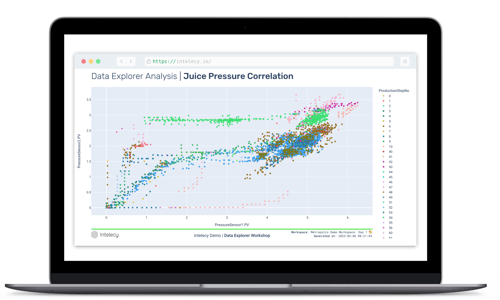
Trending data is good for visualizing data over time, but it can be difficult to compare different tags by looking at a trend. This is where scatter plots become useful.Scatter plots give you a better understanding of correlations between properties when looking at a small number of dimensions at a time. If you have a scatter plot of two tags, and would like to know how this has evolved over time, you can add time as coloring, as you can see above. Coloring can be continuous or categorical. You also have the option to view data in 3D plots.


Parallel coordinate plots
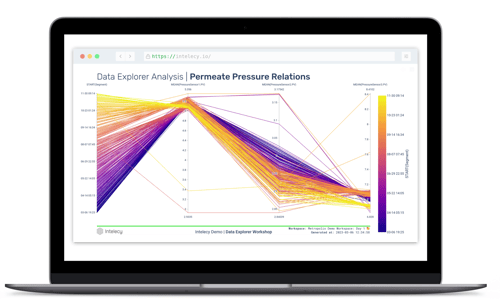
Quite often data exploration can become challenging. There are multiple variables involved, which can be difficult to visualize. This is where parallel coordinate plots can help. Parallel coordinate plots is an efficient way to visualize and analyze high-dimensional datasets. Parallel coordinate plots are available both for raw time series data and segmented data.
Overlaid segments
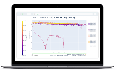
This type of plot is specifically tailored to segmented data and enables efficient comparison of time series curves over distinct segments or batches.
A common use case is to observe how a value evolves through production batches over time. This could be any variable of interest, such as temperature, vibration, yield or capacity. The analysis is not limited to batch data; it can also be used e.g. to compare daily power consumption patterns.s.


Collaboration
Share Data Explorer results with colleagues inside (or outside) your company. Take a snapshot of an analysis, and securely share it with anyone, even if they don’t have an Intelecy account. The exported reports are self-contained (all data is embedded in the report), fully interactive (users can zoom, filter, print) and can even be saved for offline access.
